Bounty Holder Wave Walls
Created 1 months ago
Remixed once
Description
A dual-cylinder shell designed with continuous, fluid wave cuts ascending its outer walls. The structure maintains its integrity via a solid binding rim at the top, leaving an uninterrupted channel down the primary face to expose the nested inner spire.
Structural Details
- Core: Hollow 35mm inner spire.
- Outer Wall: 160mm diameter with sweeping sine-wave relief cuts.
- Binding: The top of the outer wall remains solid, tying the wave segments together.
- Access: A singular straight 35mm channel runs the full height of the assembly.
Photos
Technical views
More like this
Explore more in Decor & Display →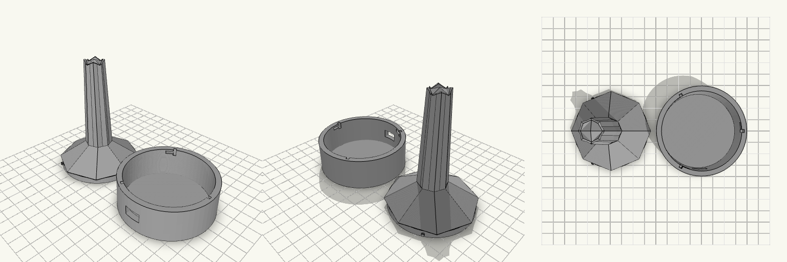
Barad-dûr — Smart Ring Tower
A dark, armored ring holder inspired by the spiked aesthetics of fantasy crowns, designed to securely hold rings from US sizes 6 to 14. Features Tapered Spire: The main column tapers gradually to accommodate a wide range of ring sizes, catching small rings at the top and larger rings toward the base. Internal Sensor Channels: Features two hidden 5mm channels running up the length of the front and right tips, stopping just 0.4mm short of the surface, allowing for concealed sensors. Textured Base: The base flares out dramatically with horizontal armor grooves for stability and style.
Verdenstro Spillebrikker
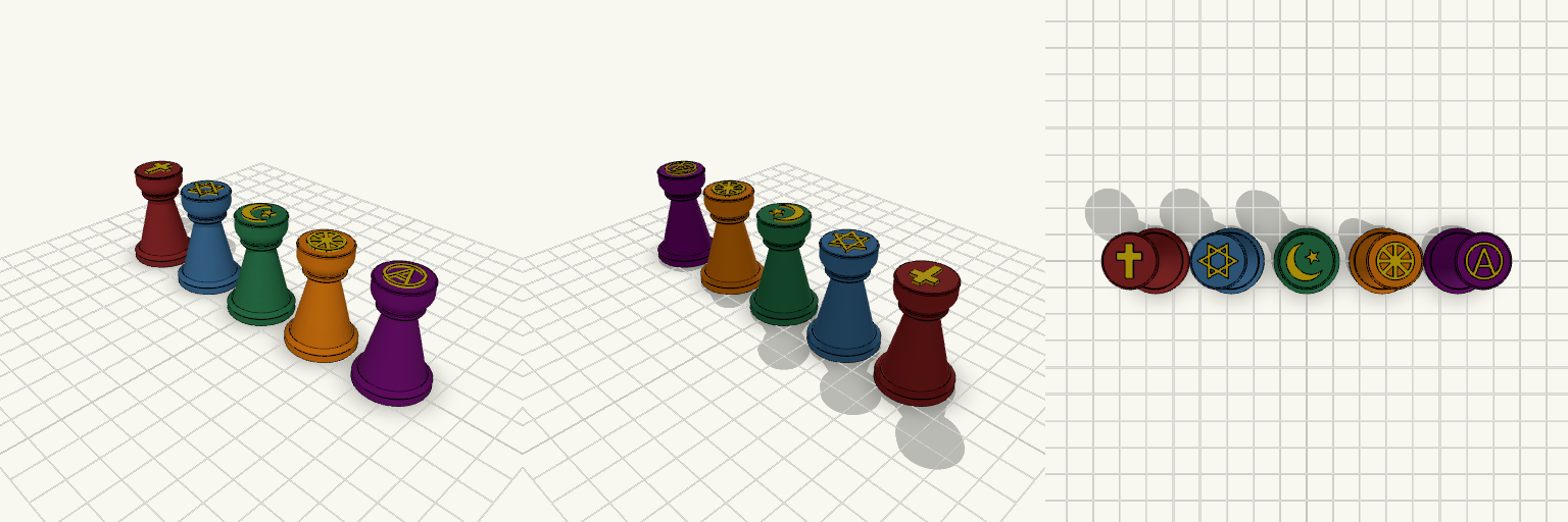
Et sæt af fem klassiske spillebrikker designet til brætspil i religionsundervisningen. Hver brik bærer et tydeligt taktilt symbol på den flade top, der repræsenterer en stor verdensreligion eller livssyn. Sættet indeholder: Kristendom: Det kristne kors Jødedom: Davidsstjernen Islam: Halvmånen og stjernen Buddhisme: Livshjulet (Dharmachakra) Ateisme: Et "A" omkranset af en cirkel Brikkerne har en bunddiameter på 24 mm og står solidt på de fleste spilleplader. Symbolerne er hævet 0,8 mm, hvilket gør dem lette at aflæse med fingrene under spillet.
Comic Speech Bubble Plaque - Java Devil
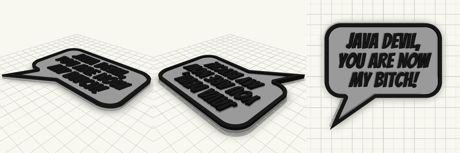
A two-color graphic novel speech bubble plaque with raised border and text, ready for a mid-print filament swap. Remix Hooks Base Dimensions: Currently 110mm x 70mm, plus the tail. You can adjust the bubblewidth, bubbleheight, and corner_radius to frame shorter or longer quotes. Text Profile: Size 14 Bangers font, extruded to 4mm total height (2mm base + 2mm text). Swaps: Designed to print the base in one color (e.g., white) and swap at Z=2.2mm for a high-contrast border and text (e.g., black).
JavaDevil — Comic Bubble
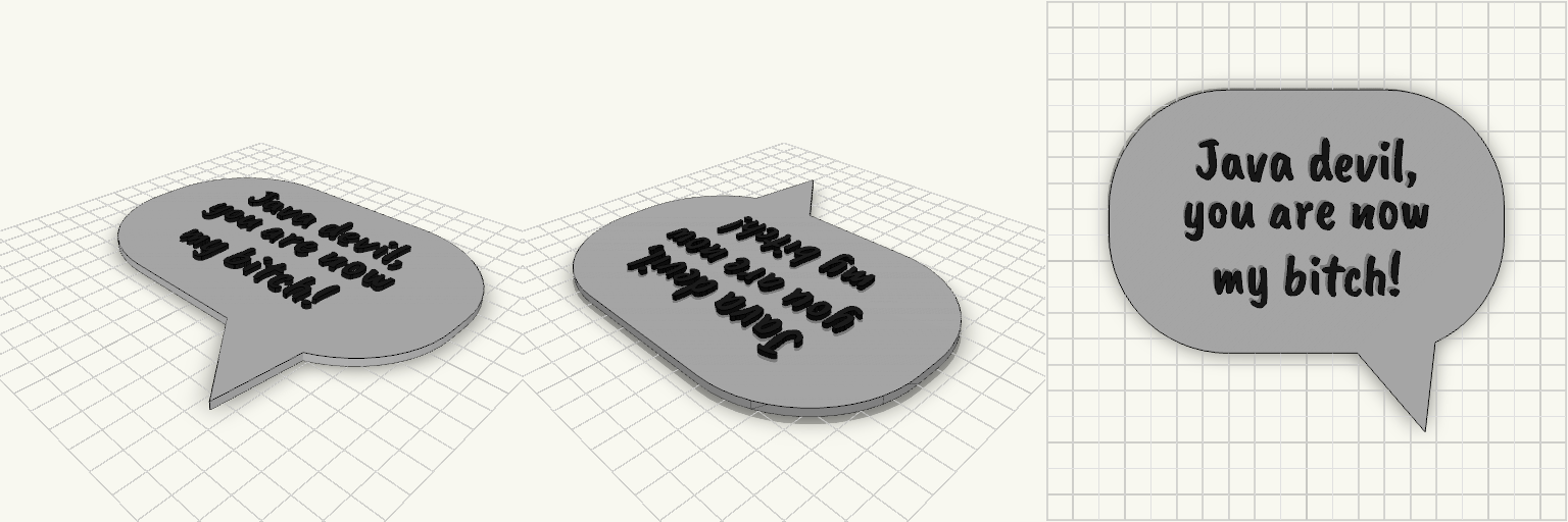
The JavaDevil — Comic Speech Bubble is a classic dialogue callout designed to make a statement. Featuring a bold, rounded backing plate and a dynamic dialogue tail, this piece brings graphic novel energy straight to the physical world. The text is typeset in Caveat Brush and split across three lines for maximum impact and readability within the bubble's constraints. Features Classic Comic Shape: 150mm wide rounded rectangle with a sharp dialogue tail. Embossed Lettering: The text stands 2mm proud of the 3mm base, creating a distinct visual break. Dual-Color Ready: The crisp height transition makes this ideal for a mid-print filament swap, ensuring the black lettering pops against the white background.
Comic Quote Bubble Plaque - The Tick
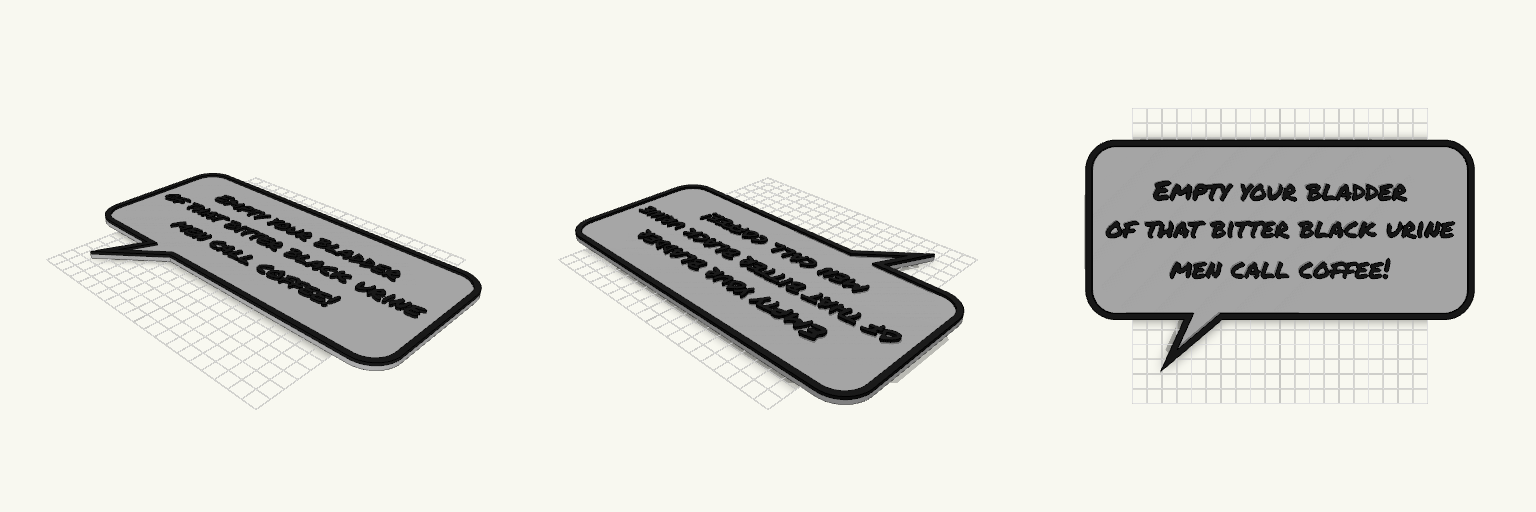
A comic-book style speech bubble plaque featuring a classic dramatic quote. The raised text and border are designed for a mid-print filament swap to make the lettering pop. What it's for Wall art or a desk display for coffee enthusiasts with a flair for the dramatic. The flat back allows for easy mounting with adhesive strips. Dimensions Width: 260 mm Height: 155 mm (including the tail) Depth: 5 mm total (3 mm base, 2 mm raised lettering) Print notes Print flat on the build plate. Schedule a manual pause or M600 filament swap at the 3 mm height to print the text and border in a contrasting color.
170mm Western Plaque
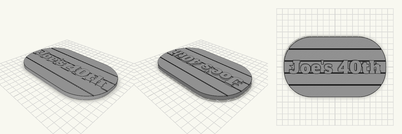
A 170mm pill-shaped wooden-style plaque featuring custom text and decorative stars. Designed to sit flat against a wall or shelf. Size: 170 mm × 100 mm × 8.5 mm. Features: Deep plank grooves running horizontally across the back plate. Font: Alfa Slab One, bracketed by twin five-point stars. Mounting: Flat back, suitable for command strips or leaning.